Next Room
aka.
how easy it is to lose trust when it comes to your money
aka.
how easy it is to lose trust when it comes to your money
Keep Super Simple
Keep Super Simple
aka. how easy it is to lose trust when it comes to your money
aka. how easy it is to lose trust when it comes to your money
aka. how easy it is to lose trust when it comes to your money
Proposed tool to find out how much your super will cost you
Proposed tool to find out
how much your super
will cost you
Reviewer specs
Reviewer
specs
Client
Client
Roles
Tools
Duration
National superannuation company
Lead product designer
Market research
User discovery
Mid-fi wireframes
Hi-fi wireframes
Workshop facilitation
User testing
Figma
Microsoft Clarity
Miro
Microsoft Teams
Adobe Analytics
Customer Journey Analytics
6 months

Fees page re-imagined
It can be word-of-mouth, a life event, or just something catching your eye in your yearly balance.
And this is what the client was looking to figure out - the entry points and the areas to simplify their existing fees page and find new members and keep existing ones.
The fees page, connected to previous work, had a measurable drop-off rate, and left users confused about what they were paying and why. It was also found that there was feelings of distrust due to these hidden fees.
The challenge was to redesign the experience from the group up and from a place of transparency whilst maintaining legal and marketing compliance.
Leading discovery to identify what the biggest confusion points were, I produced designs for user testing.
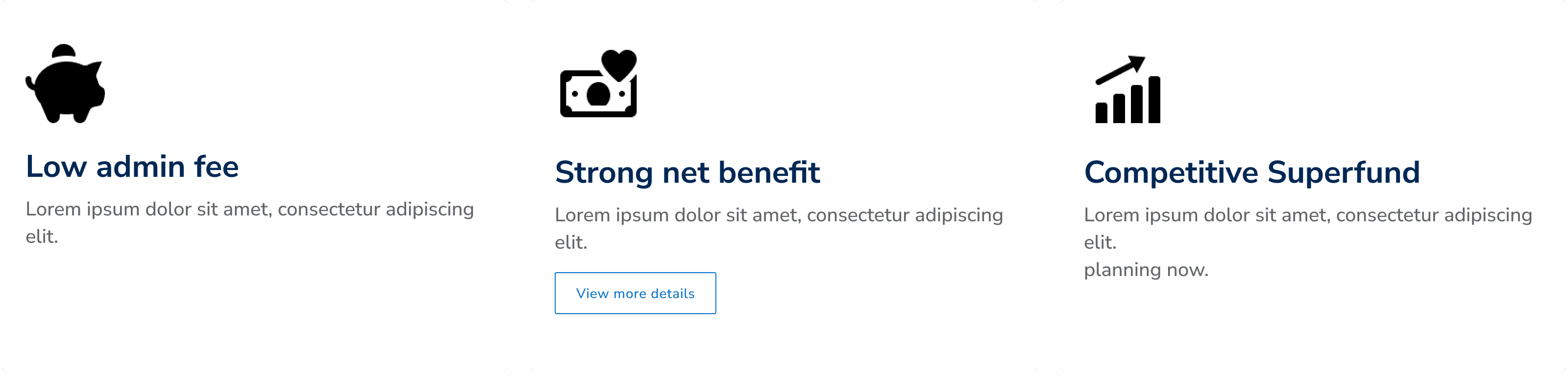
The top unique selling points for the superannuation fund
The top unique selling points for the superannuation fund
Fees page
re-imagined
Fees page re-imagined
It can be word-of-mouth, a life event, or just something catching your eye in your yearly balance.
And this is what the client was looking to figure out - the entry points and the areas to simplify their existing fees page and find new members and keep existing ones.
The fees page, connected to previous work, had a measurable drop-off rate, and left users confused about what they were paying and why. It was also found that there was feelings of distrust due to these hidden fees.
The challenge was to redesign the experience from the group up and from a place of transparency whilst maintaining legal and marketing compliance.
Leading discovery to identify what the biggest confusion points were, I produced designs for user testing.
It’s on us to help you understand
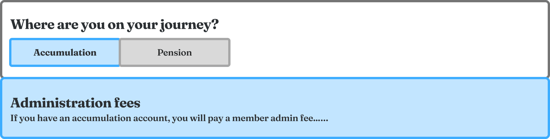
Members interviewed assumed there was only insurance fees and yearly fees.
It was also found that many users left before any fee information was shown.
Hence, putting everything at the top improved expectations and reduced confusion.
Members interviewed assumed there was only insurance fees and yearly fees.
It was also found that many users left before any fee information was shown.
Hence, putting everything at the top improved expectations and reduced confusion.
Descriptions of all levels of financial literacy

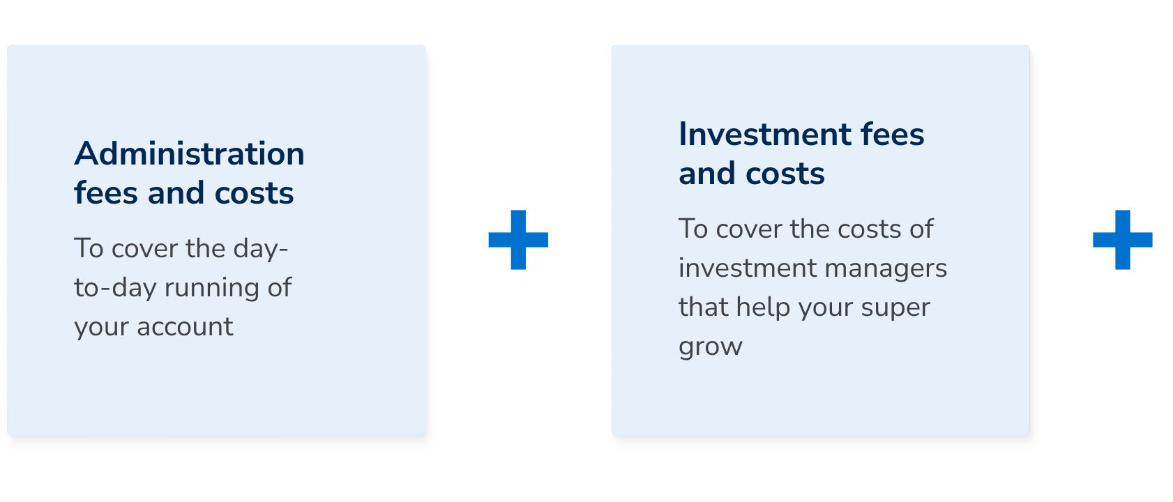

It’s on us to help you understand
Members interviewed assumed there was only insurance fees and yearly fees.
It was also found that many users left before any fee information was shown.
Hence, putting everything at the top improved expectations and reduced confusion.
Hope to be super helpful

This was an end-to-end design process; I led discovery through to development, managing changing expectations from the product owner client-side.
The simplification of content and layout already exceeded stakeholder expectations.
The conversation evolved from a tool about net benefit, the super competitive edge, to their yearly fee. This was most feasible and also the most practical for a first build and development.
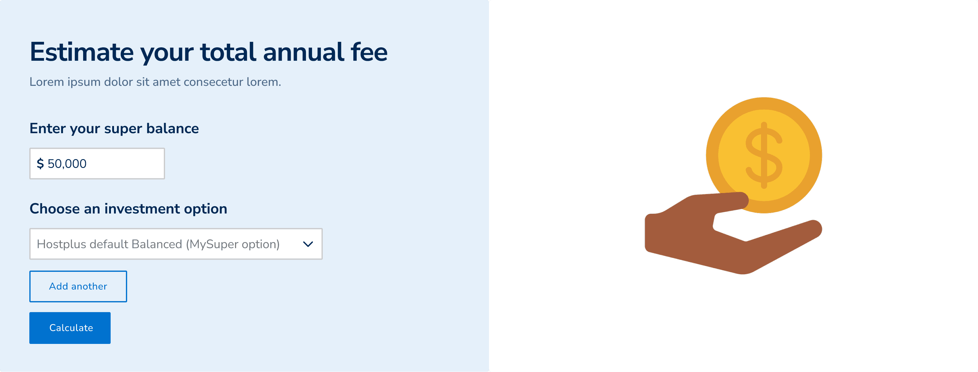
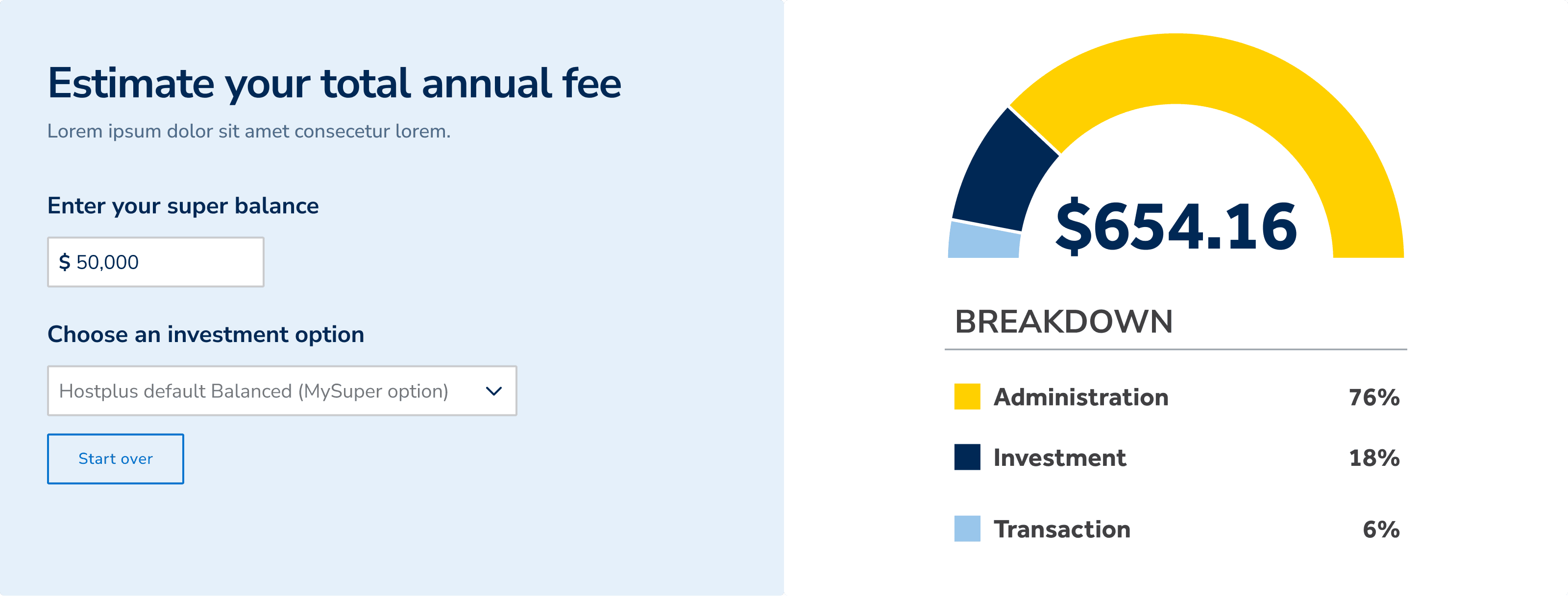
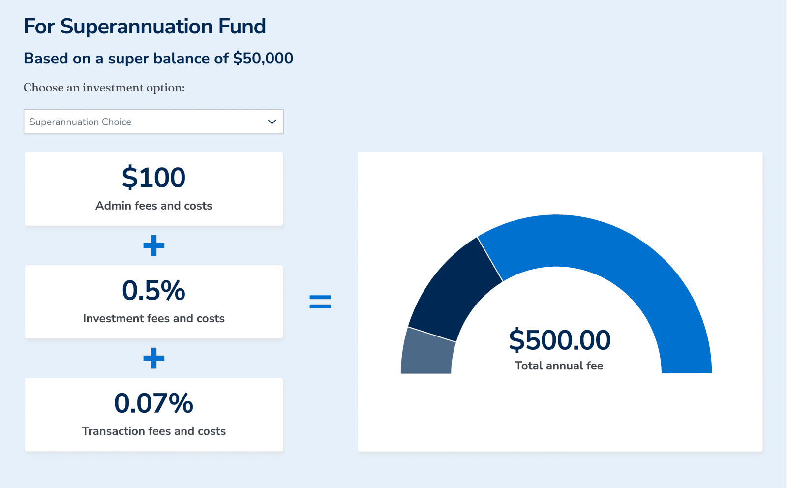
Members seek tailored results based on their account option and balance.
Because of this, I tested a tool drawing from existing data.
This was an end-to-end design process; I led discovery through to development, managing changing expectations from the product owner client-side.
The simplification of content and layout already exceeded stakeholder expectations.
The conversation evolved from a tool about net benefit, the super competitive edge, to their yearly fee. This was most feasible and also the most practical for a first build and development.
Members seek tailored results based on their account option and balance.
Because of this, I tested a tool drawing from existing data.
Revised tool
Revised tool
Hope to be super helpful
Hope to be super helpful
Checkpoints throughout design
Checkpoints throughout design
This experience won approval from leads and 8 user interviews were conducted.
The new design received an overall System Usability Score of 76%, with many citing improvement in explaining the relevant fees.
Whilst most enjoyed the new layout, users were still confused by terminologies, even though it’s listed at the bottom of the page.
Before closure, the recommended next steps to the client were include hover states for each definition and continue to investigate the relevance of net benefit on this page, as users tested did not show much interested in this section.
For me, it confirmed that this page needed to reduce friction and reassure users that they should understand what they are paying for, and you can build trust by breaking things down.
Lessons learned
Lessons learned
Lessons
learned
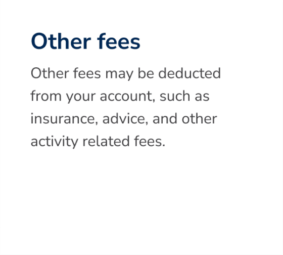
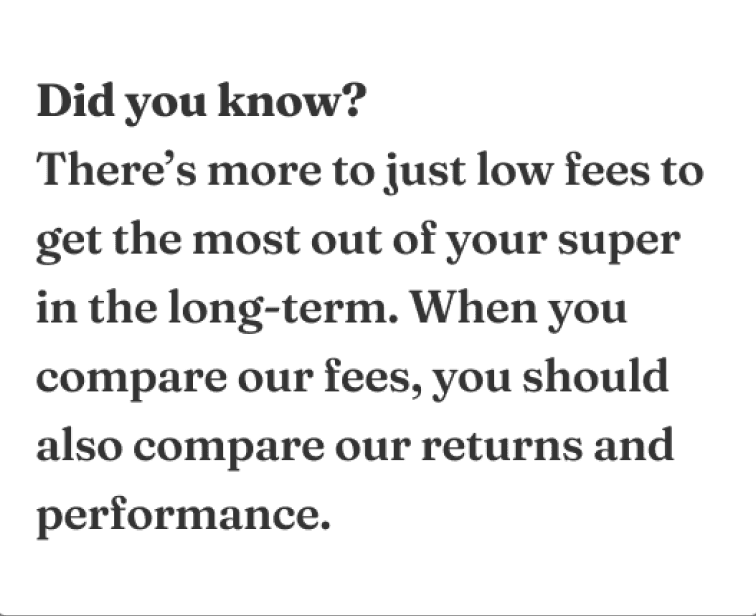
Call-outs like these were the perfect blend for user re-assurance and marketing


Call-outs like these were the perfect blend for user re-assurance and marketing
Call-outs like these were the perfect blend for user re-assurance and marketing