aka.
how easy it is to lose trust when it comes to your money
aka.
how easy it is to lose trust when it comes to your money
Guide Fair Decisions
Guide Fair Decisions
aka. how to get outcomes of health complaints sooner
aka. how easy it is to lose trust when it comes to your money
aka. how easy it is to lose trust when it comes to your money


Activity templates and meeting tabs
Proposed tool to find out
how much your super
will cost you
Reviewer specs
Client
Roles
Tools
Duration
Government health authority
Product designer
Current/future user journey mapping
User story validation
User personas
Workshop facilitation
Mid-fi prototypes
Hi-fi prototypes
Figma
Microsoft Teams
Salesforce CRM
Jira
6 months
Processing health-related complaints
Imagine this flow as all emails with attachments. Each green computer was once a large non-searchable document online.
We assume a system works in our favour when serious complaints happen involving health professionals. The sad truth is some take months to resolve due to a backend of emails lost in an inbox and decision-makers scanning.
Urgency has strong ties with efficient systems in place.
I was tasked as owning the user group of decision makers in Phase 1 for an out-of-the-box Salesforce CRM online site portal to aid decision makers from receiving a case through to resolving one.
All in one place and accessible when needed.
I first extracted information from a previous consultancy and ran workshops with key stakeholders on what is done now.
Imagine this flow as all emails with attachments. Each green computer was once a large non-searchable document online.
We assume a system works in our favour when serious complaints happen involving health professionals. The sad truth is some take months to resolve due to a backend of emails lost in an inbox and decision-makers scanning.
Urgency has strong ties with efficient systems in place.
I was tasked as owning the user group of decision makers in Phase 1 for an out-of-the-box Salesforce CRM online site portal to aid decision makers from receiving a case through to resolving one.
All in one place and accessible when needed.
I first extracted information from a previous consultancy and ran workshops with key stakeholders on what is done now.
Decision makers require access to key information in a court hearing

Processing health-related complaints
Reviewer specs
Client
Roles
Tools
Duration
Government health authority
Product designer
Current/future user journey mapping
User story validation
User personas
Workshop facilitation
Mid-fi prototypes
Hi-fi prototypes
Duration
6 months
Figma
Microsoft Teams
Salesforce CRM
Jira
1 month

Processing health-related complaints
Imagine this flow as all emails with attachments. Each green computer was once a large non-searchable document online.
We assume a system works in our favour when serious complaints happen involving health professionals. The sad truth is some take months to resolve due to a backend of emails lost in an inbox and decision-makers scanning.
Urgency has strong ties with efficient systems in place.
I was tasked as owning the user group of decision makers in Phase 1 for an out-of-the-box Salesforce CRM online site portal to aid decision makers from receiving a case through to resolving one.
All in one place and accessible when needed.
I first extracted information from a previous consultancy and ran workshops with key stakeholders on what is done now.
Flow from the main page to a roadmap of your career
Small actions towards big decisions
Working closely with Business Analysts, we went through each existing functional requirement and updated them.
Time was short, so I prioritised each moment that mattered.
The beginning of the user journey -
it is important as a decision maker to uses an iPad in cases.


Decision-makers do the most
From here, a current state journey map was formed, which we discovered do a lot of heavy lifting when complaints are received.
Some are brought in on a case-by-case basis, so understanding context is pivotal for an informed choice. Although highly specialised in knowledge, they represent the community at large and the profession.
Therefore, we identified the pain points aren’t a lack of understanding, but a lack of access.
User profile about decision makers made for client

Lessons learned
At times, it felt design was not as prioritised in this phase.
To respond to this, we advocated for design through learning best communication methods for types of questions – if it’s call-ready or just a message.
An example of this was Figma annotations for the technical team, and 15-min weekly validation sessions with the business analysts.
This was one of my favourite projects I’ve worked on.
Working across different teams and building on something that serves the community is a joy I wish to continue searching for.
Site map of key screens that served as mental model for decision-makers

One team mindset
As a result, I continued the new few months fleshing out the indicative prototype with the developers – and closing user stories on the design-end on Jira.
Leaving space for integrations during their sprint planning discussions.
This led to 400+ requirements and 30 screens completed and a new digital experience that reduced staff overload by reducing inconsistencies of information.
Mobile view of the first functional requirement and developer-ready screens


Out of the box, actually
During the design stage, I mapped the future state with each checkpoint marking a screen.
Standard components were used in the existing Salesforce design system.
As there was not much customisation with colour scheme, it was decided to prioritise efficiency and time-based use cases.
A key driver for success was optimising the decision point, which, through stakeholder engagement, turned out to be right before the hearing.
User requirements to automate tasks in on the Salesforce portal


Processing health-related complaints
Imagine this flow as all emails with attachments. Each green computer was once a large non-searchable document online.
We assume a system works in our favour when serious complaints happen involving health professionals. The sad truth is some take months to resolve due to a backend of emails lost in an inbox and decision-makers scanning.
Urgency has strong ties with efficient systems in place.
I was tasked as owning the user group of decision makers in Phase 1 for an out-of-the-box Salesforce CRM online site portal to aid decision makers from receiving a case through to resolving one.
All in one place and accessible when needed.
I first extracted information from a previous consultancy and ran workshops with key stakeholders on what is done now.
Decision makers require access to key information in a court hearing
Small actions towards big decisions
Working closely with Business Analysts, we went through each existing functional requirement and updated them.
Time was short, so I prioritised each moment that mattered.
The beginning of the user journey - it is important as a decision maker to uses an iPad in cases.
Working closely with Business Analysts, we went through each existing functional requirement and updated them.
Time was short, so I prioritised each moment that mattered.
The beginning of the user journey -
it is important as a decision maker to uses an iPad in cases.
Small actions towards big decisions
User profile about decision makers made for client
Decision-makers
do the most

From here, a current state journey map was formed, which we discovered do a lot of heavy lifting when complaints are received.
Some are brought in on a case-by-case basis, so understanding context is pivotal for an informed choice. Although highly specialised in knowledge, they represent the community at large and the profession.
Therefore, we identified the pain points aren’t a lack of understanding, but a lack of access.
User requirements to automate tasks in on the Salesforce portal
Out of the box, actually
During the design stage, I mapped the future state with each checkpoint marking a screen.
Standard components were used in the existing Salesforce design system.
As there was not much customisation with colour scheme, it was decided to prioritise efficiency and time-based use cases.
A key driver for success was optimising the decision point, which, through stakeholder engagement, turned out to be right before the hearing.
Decision-makers do the most
From here, a current state journey map was formed, which we discovered do a lot of heavy lifting when complaints are received.
Some are brought in on a case-by-case basis, so understanding context is pivotal for an informed choice. Although highly specialised in knowledge, they represent the community at large and the profession.
Therefore, we identified the pain points aren’t a lack of understanding, but a lack of access.
User profile about decision makers made for client
Out of the box, actually
During the design stage, I mapped the future state with each checkpoint marking a screen.
Standard components were used in the existing Salesforce design system.
As there was not much customisation with colour scheme, it was decided to prioritise efficiency and time-based use cases.
A key driver for success was optimising the decision point, which, through stakeholder engagement, turned out to be right before the hearing.
User requirements to automate tasks in on the Salesforce portal
Decisions made easier
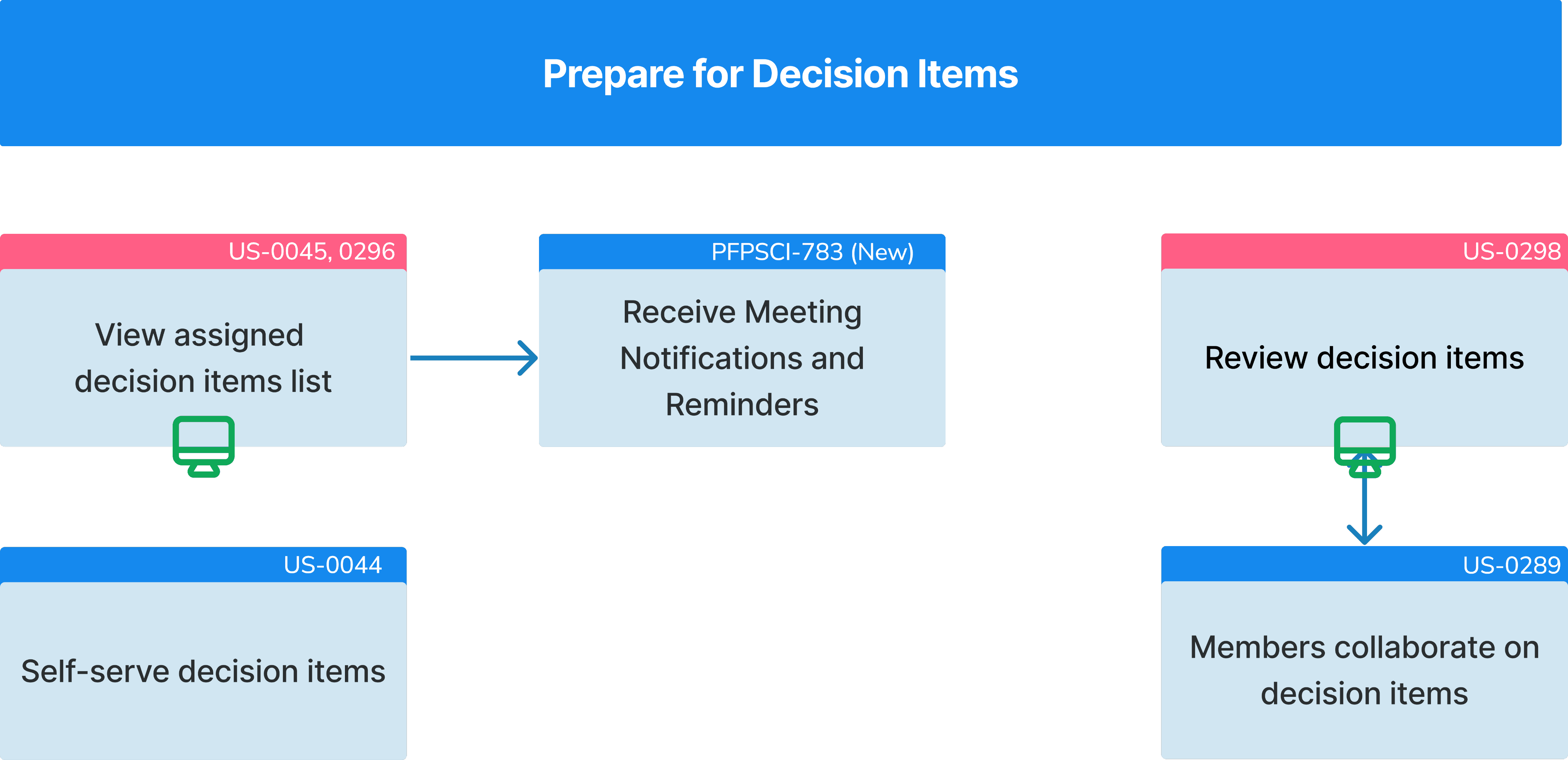
What was once a slew of email attachments and CC’s (with the accidental BCC), now sits siloed and categorised.
There was initial difficulty defining what is defined as a decision item, but through tech discussions, we captured it.
Pink are the pivotal moments that matter on the portal
One team mindset
As a result, I continued the new few months fleshing out the indicative prototype with the developers – and closing user stories on the design-end on Jira.
Leaving space for integrations during their sprint planning discussions.
This led to 400+ requirements and 30 screens completed and a new digital experience that reduced staff overload by reducing inconsistencies of information.
As a result, I continued the new few months fleshing out the indicative prototype with the developers – and closing user stories on the design-end on Jira.
Leaving space for integrations during their sprint planning discussions.
This led to 400+ requirements and 30 screens completed and a new digital experience that reduced staff overload by reducing inconsistencies of information.
Mobile view of the first functional requirement and developer-ready screens
Mobile view of the first functional requirement and developer-ready screens
One team mindset
Lessons learned
At times, it felt design was not as prioritised in this phase.
To respond to this, we advocated for design through learning best communication methods for types of questions – if it’s call-ready or just a message.
An example of this was Figma annotations for the technical team, and 15-min weekly validation sessions with the business analysts.
This was one of my favourite projects I’ve worked on.
Working across different teams and building on something that serves the community is a joy I wish to continue searching for.
Site map of key screens that served as mental model for decision-makers
Reviewer specs
Client
Roles
Tools
Duration
Government health authority
Product designer
Current/future user journey mapping
User story validation
User personas
Workshop facilitation
Mid-fi prototypes
Hi-fi prototypes
Figma
Microsoft Teams
Salesforce CRM
Jira
6 months
Site map of key screens that served as mental model for decision-makers
Lessons learned
At times, it felt design was not as prioritised in this phase.
To respond to this, we advocated for design through learning best communication methods for types of questions – if it’s call-ready or just a message.
An example of this was Figma annotations for the technical team, and 15-min weekly validation sessions with the business analysts.
This was one of my favourite projects I’ve worked on.
Working across different teams and building on something that serves the community is a joy I wish to continue searching for.